After importing the one you feel comfortable using as a starting point, it’s time to open the editor and start customising it into another style variation.
It might be a good idea to clone the Style Kit and give it a different name. This way you can maintain the original styles and revert back to them if you need.
Customisation
We can customise every aspect of the global styles, but we will focus on Typography, Colors and Spacing.
Using the Style guide utility template
We suggest that on a new template or page you insert Style Guide, one of the Utility patterns from the Library
This pattern includes a basic layout with the Style Kits Fonts and Colors, and will help you see how the customised global Typographic styles affect the elements in the editor, in real time.
Typography
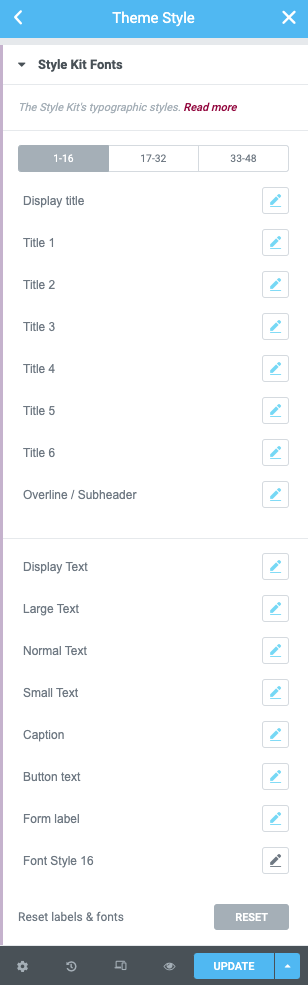
All Style Kits share a consistent framework of Typography, and it’s easy to customise via the Global Style Kits Fonts panel.
In this panel you will find all the typographic styles that are used across the patterns, templates and layouts.
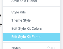
Access the Style Kits fonts panel through the right-click menu
Edit the styles in the Style Kits Fonts panel
Useful tips:
The body / main text size is controlled by the Normal Text. Edit this style, and most of your body text typography will be affected. Titles 1-6 affect the Headings 1-6 styles respectively.
Color
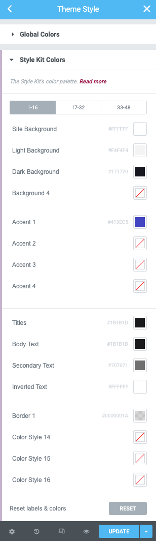
In a similar way you can start customising the Style Kits color palette.
Go to the Global Style Kit colors and edit any of the colors in the palette, based on their role.
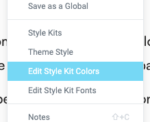
Access the Style Kits Colors panel through the right-click menu
Edit the colors in the Style Kits Color panel
Useful tips:
You can try to customise the Accent color first. It can be one of your brand’s main colors. This color will apply to your buttons and links. You may also want to edit the Site BG color. This color defines the background of your entire website.
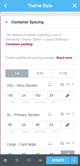
Spacing
Spacing is managed via the Container Spacing presets. By default Style Kits Patterns makes use of the first 5 presets, to manage global padding.
You can use these spacing presets across all new containers / patterns that you will create yourself. Learn more about container spacing presets and how to customise them to fit your needs.
Edit the Spacing presets in the Container spacing panel
Useful tips:
Try customising the values for the XL (Primary Section) preset first. This preset is applied to almost every section of your layout, and it’s a great way to globally adjust the spacing of your pages site-wide.