Padding presets is a spacing scale for the Elementor container widget. Similar to how Outer Section Padding and Column Gap legacy controls worked, this new feature allows you to create padding presets and apply the dynamically on your containers.
The outcome is that you can manage your container spacing with globally managed presets, resulting in consistent layouts across pages.
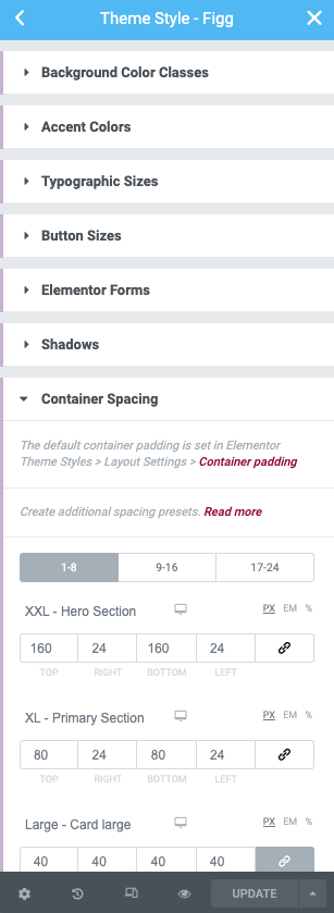
The Containers panel in included in Theme Style > Style Kits > Container Spacing
Panel Overview
You can use up-to 24 spacing presets for your containers. The free version allows for only 8 presets.
The presets are organised in tabs of 8.
Default Spacing presets
By default, every Style Kit comes with a set of predefined spacing presets (1-5). These are:
XXL – Hero Section
XL – Primary Section
Large – Card Large
Medium – Card Normal
Small
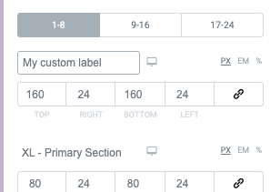
Using custom labels
One thing you will notice straight out of the box, is that you now have the ability to use your own labels for each of the five presets, allowing you to use a more meaningful spacing scale.
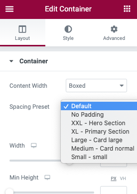
Applying spacing to containers.
Applying the presets is easy. On each container, you will find a dropdown that allows you to select which preset you want to use on the container. The padding will then be applied on the container.
After editing the label of any of the presets, when you get back to the editor you must refresh the page, in order for the updated preset names to be displayed in the dropdown.
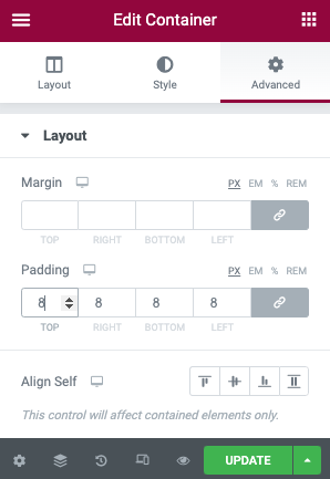
Overriding container spacing
You can override the spacing preset by manually adding a custom value to the container’s padding, under the Advanced tab.