Similar to Elementor Global Colors, Style Kit Colors are Global color styles that can be used dynamically in any element of the layout, across all pages.
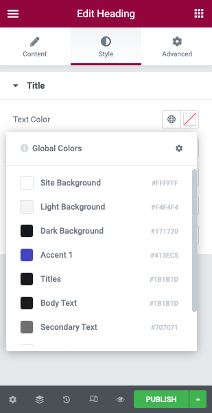
Style Kit global colors can be applied to any element just like Elementor’s global colors, by clicking the “global” icon next to the color pickers.
Style Kits global colours will be available in the mini-popup, along with any other Elementor global colors.
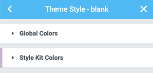
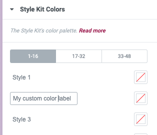
The Style Kit Colors panel
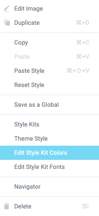
Style Kit global colors panel is located under the Elementor Global colors. You can easily access it using the “Edit Style Kit Colors” shortcut in the right-click menu.
Quick-access from the right-click menu
Right-click on any element in the editor to open the contextual menu. You can find a text link to teleport you to the Style Kit Fonts.
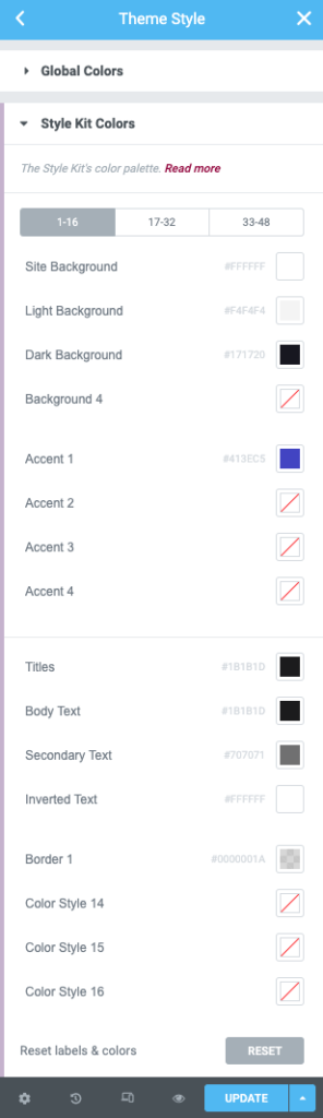
Panel Overview
To avoid long scrolling, the 48 variables are divided into three tabs of 16 slots each.
Background / Surface Colors
These are colors that are mainly used on surfaces and backgrounds.
Site background: The main background / body of your site
Light background: A light color that can be used to separate sections and surfaces
Dark background: A dark color that requires inverted / negative text to be displayed over it
Background 4: A blank slot for your custom color
Accent / brand Colors
With accent colors we refer to colours derived from the brand’s color palette and used in the layout to add expressiveness and tone, and draw attention.
Accent colors are applied on elements like buttons, links, icons and specific “brandable” areas. They can also be used as background colours, and applied on surfaces.
Accent 1 (Primary accent): Button and usually links color
Accent 2: Another color slot that can be used for a wider palette of accent/brand colors. This is a blank placeholder to add any of your brand colors.
Accent 3: Another slot for the same purpose.
Accent 4: Another slot for the same purpose.
Typographic colors
Typographic colors are applied on Text and Titles, and consist of:
Titles: The color of the Headings.
Text: Body text color
Secondary Text: A variation of the body text color
Inverted Text: Text that is displayed over a dark (or accent) background needs to be inverted (for example white text over black background).
Other / supportive colors
This is a set of 4 extra color variables that you can use for own purposes.
Border 1: Thin line borders are assigned this color variable
Color 14: A blank placeholder to add your color.
Color 15: A blank placeholder to add your color.
Color 16: A blank placeholder to add your color.
Customising the labels
You can customise the label of each variable, by clicking on it.