One of the Style Kits widgets is the SK – Style Switcher. This allows you to have a toggle or dropdown at the frontend of your site, allowing for the users to switch between 2 or more Style Kits.
This unlocks the potential for two things:
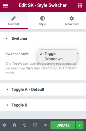
1. Using the Toggle Style, you can have a front-end light / dark mode functionality where users can pick the appropriate contrast. This mode works with two Style Kits.
2. Using the Dropdown Style, you can showcase pages to your clients, and show them different styles for the layouts. You can use as many Style Kits as you want in this mode.
Toggle Style
As the name suggests, this style output a Toggle, that switches between two Style Kits.
In the screenshot below:
Toggle A – Default
This is the default toggle, and will always display the Global Style Kit (or the style kit of the specific page). You have the option to customise the icon, and edit the styles under the Style tab.
Toggle B
This is the second toggle, which loads the secondary Style Kit. Choose an icon and pick a Style Kit from the dropdown, to switch to.
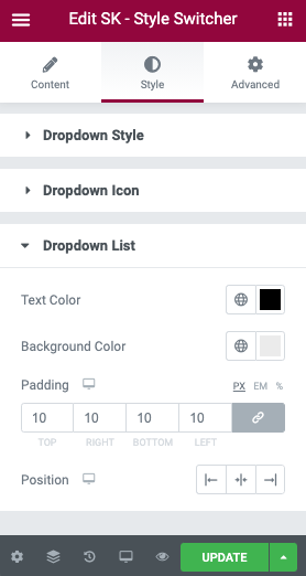
Customising styles
As with most elementor widgets, the Style Switcher allows you to customise the appearance of the toggles and dropdowns, in order to make them blend well with your existing styles. You can find the Styling options at the Style tab of the widget.