This feature is deprecated in the latest versions of Style Kits. Please make sure that you are running on the latest plugin version in order to enjoy all the new features. Learn more about legacy features.
The Accent Colors Panel
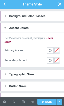
In the Elementor Theme Style Editor, head over to the Accent Colors section at Style Kits Panel. There you will find the color pickers for optionally defining a primary and/or secondary accent color.
Primary Accent
This is used as the primary link color. Icons and dividers also inherit this value.
You can set a different link color if you want, under the Typography panel. This way your primary accent color will only apply on your icons. Link color under the default Typography panel will always override the Primary Accent color.
Secondary Accent
The secondary accent color will apply on your buttons, and will replace the default Elementor button color.
If you select a different color for your buttons under the Buttons panel, it will always override the Secondary accent color.