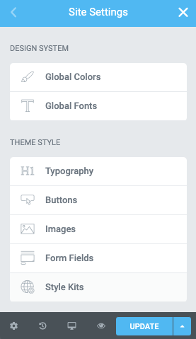
We now have two “control gates” for color-styling our design system. Elementor’s Global colors and Style Kits
Let’s take a look on how we can have a friendly interference between both.
The concept is simple. We will define a few global colors in Elementor, and we will link those globals with the Style Kits colors.
This way we maintain a dynamic relationship between the two and keep things simple from a color-management perspective.
Defining the Elementor Global Colors
It only takes a couple of minutes to create global colors and end up with an efficient color system for your project..
If you are using color in Style Kits already, just translate your existing SK colors to global ones, using similar naming.
Tips for defining a global color palette in Elementor
Regardless if you are using Style Kits or not, you really need to keep things globally simple.
You can be very efficient with very little, so try not to use more than 8-10 global colors in your entire composition.
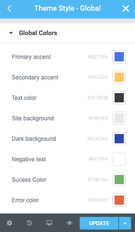
Here is a a minimal global color setup I would define as global colors, and try to use those wherever I need to output color in my layout.
Primary and secondary accent
Color for your text links, buttons, main and supportive brand color.
Text color
A color for the typographic Elements.
Site background
This is your body background color. It affects most of the other colors.
Dark surface color
A variant background color for sections that have a dark background color, and require negative-colored text.
Negative Text
This is the color that will be applied on text over dark surface colored sections.
Success and Error colors
Make sure you include these globals so you can have harmonious colors for form success / error notices.
Using Color in Style Kits
What we need to do is to “hook” these global colors we created, to our Style Kits panels.
In Style Kits, we make use of color under three panels:
- The Background color classes
- Accent colors
- Button Sizes
You can find a more detailed version of how we work with Color in Style Kits in this article.
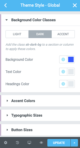
Background color classes
All the color pickers of the background color classes can be dynamically linked to a global color.
Now everytime you make a change to your Global colors, your background classes should reflect
Accent Colors
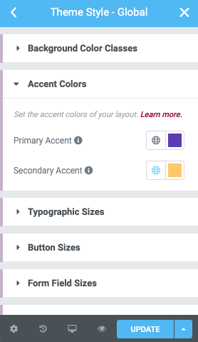
The primary and secondary accent colors can be globally linked as well.
The primary accent color affects the color of your links and icons, and the secondary accent is your button color.
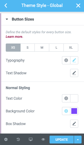
Button Colors
We can follow the same approach for each of the button size as well.
We would link those with the primary or secondary accent from our Global colors.
Give it a try with the Free version of Style Kits
You can test these out right away if you download the free version from the WordPress repository, and get a hands-on experience with the Style Kits workflow.
You can always get the most out Elementor Design with Style Kits Pro.
Wrapping up
The workflow is very efficient and applies both for users who start a new project from scratch, and existing users who want a tighter inter-play between Style Kits and Elementor’s Global Colors. We hope you will enjoy this approach as we do.
How have you been using Elementor’s global colors? Do you have any insights or cool workflow tips to share? Let us know in the comments.