Making use of a layout color system in Elementor template kits

In this article we will go through an overview of how color is globally managed in the Style Kits template library.

Introduction

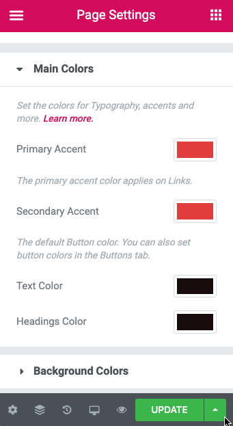
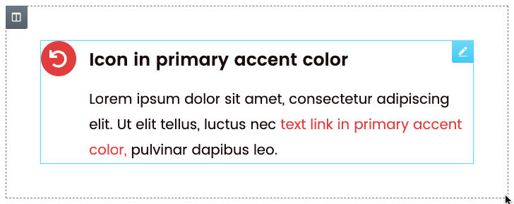
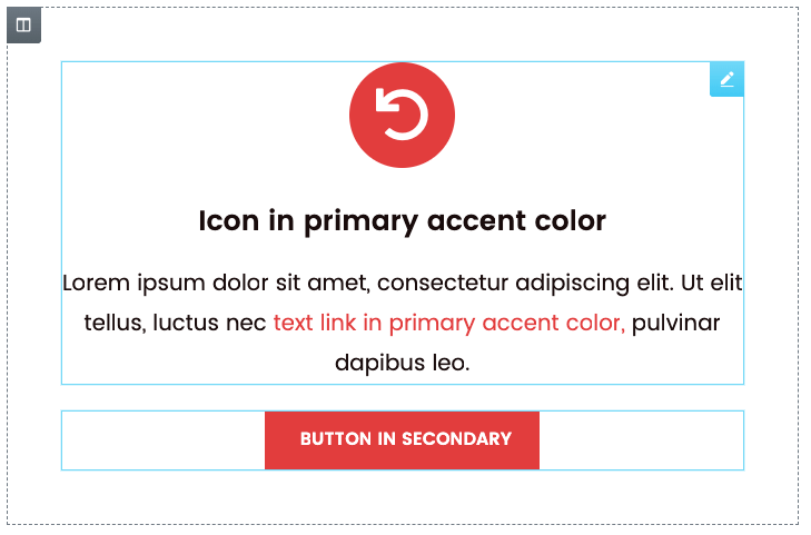
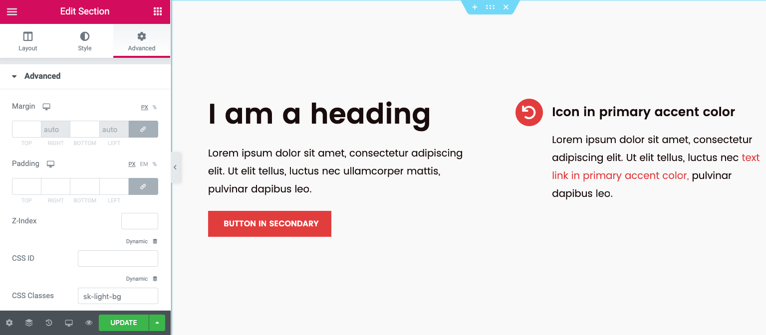
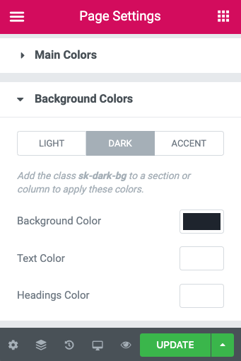
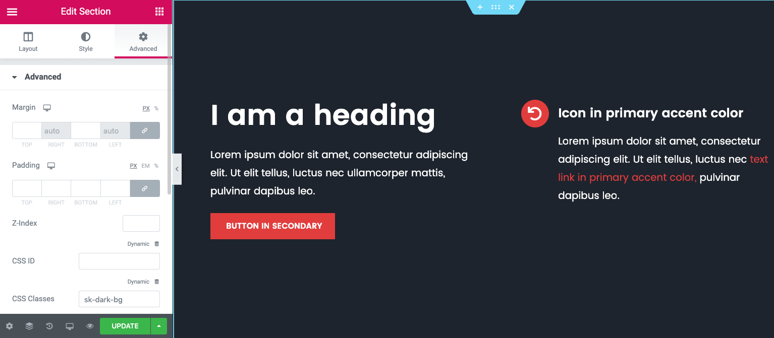
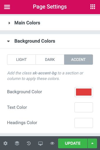
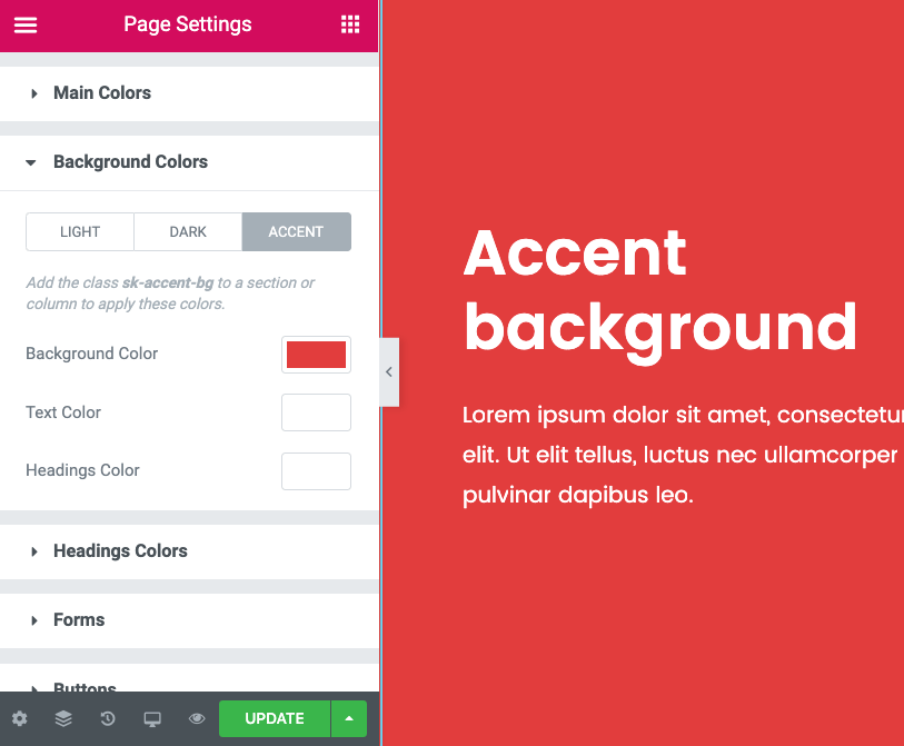
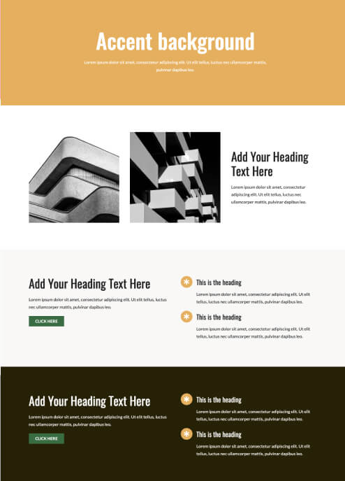
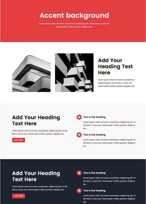
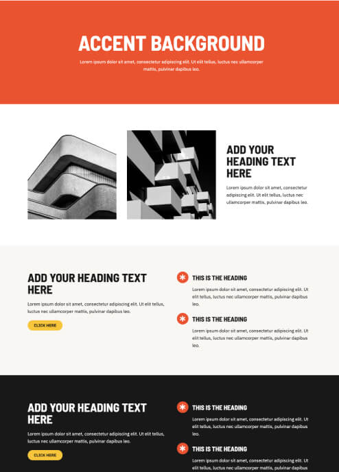
Consistent, layout-wide color management in Elementor is a struggle. But it does not need to be. In Style Kits, color is consistently used  and dynamically managed, for each template kit. 

Practically, this means that all elements in the layout use the same dynamic color properties, according to the abstractions of the layout system, which we will go through below.

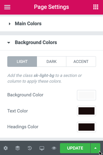
Color information is stored in the Style Kit, alongside all the other design variables (typography, spacing, forms and buttons), and (almost) never inline on the element. The color palette of each template kit is customizable by the user, and allows for brand-consistent color palettes, with any color change directly applicable on the layout.

Thanks to this component-based approach on color, we achieve:

✅ Consistent use of color throughout the entire template kit
✅ Global color management
✅ Easy template customization by the user towards a brand-consistent color palette
✅ Improved workflow in layout design

Here is how the same layout instantly adapts its color pallete when a different Style Kit is assigned on the page. 

Overview

In Style Kits, colors are abstracted based on their role in the layout. 

We have three types of colors: Typography, Accent and Surface colors. 

  • Typography colors: Used on typographic elements like Text and Headings
  • Accent colors: Primary and Secondary. These are usually brand colors, used in links, icons and buttons.
  • Surface colors: Light, Dark and Accent Backgrounds. Used on sections, columns or other small-sized areas, by adding any of the three CSS classes on these elements.

Typographic colors

Under the main colors tab in the Style Kits sidebar, you can define the colors for text and headings.

Body Text Color

The Body Text color is the main color of the text, and applies by default on all the Typographic elements. 

Headings Color

Initially, Headings inherit the Body Text color. You can choose to use a different color for your headings if you wish, by tweaking the Headings color picker.

In Style Kits Pro you also have additional controls for H1-H6 headings individually.

Primary and secondary accent

Primary accent

This is usually the main brand color, and the color of the text links. The primary accent color is also applied by default on icons and icon boxes, and dividers.

Secondary Accent

The secondary accent is a complementary brand color, which applies on the buttons. Although Style Kits allow for different color on each button size (under the Buttons  tab), all buttons (regardless the size), initially inherit the secondary accent color as defined in the Style Kit.

The secondary accent colour is not an absolute necessity. Many brands do not have a secondary accent color. For simplicity, we use a simple color palette in our example, where the same red color is applied both for primary and secondary accents.

In this case, buttons, icons and links use the same color and deliver a more simple palette.

Surface (background) colors

Surface colors are a huge aspect of our layout color system. They are applied on Elements (usually columns or sections)  via simple CSS classes. 

The Surface colors give us the option to define a customized color for the nested typographic elements. For example, when you have an area with a dark background color, you will most probably need the text colors in this section to be inverted.

In the background Colors panel, you have the ability to select three background colors, and their nested typographic colors.

Light Background

The light background can be a light variant of the accent color, or another light color that can be applied on a surface.

Defining the Light background, and nested typography colors

A surface will inherit these light background styles when you apply the class sk-light-bg in the CSS Classes field under the Advanced tab.

Dark Background

In the case of a dark background, most likely we need to use inverted typographic colors, to maintain the readability of the elements over the dark color. Similar to the light background color, we can define the inverted typographic colors in the related panel

Defining the Dark background, and nested typography colors

A surface will inherit these light background styles when you apply the class sk-dark-bg in the CSS Classes field under the Advanced tab.

Accent Background

Style Kits Pro offers an extra background color class, that we call Accent background. This is usually the same as the primary or secondary accent, and is used to highlight specific layout areas and surfaces.

Defining the Accent background, and nested typography colors

A surface will inherit these accent background styles when you apply the class sk-accent-bg in the CSS Classes field under the Advanced tab.

Wrapping up

This dynamic color approach outlined above offers robust, site-wide color management that skyrockets the customisability and scalability of the entire Template Kit collection.

You can try any of the free templates included in Style Kits Library, and see for yourself how color is globally managed. Let us know your thoughts in the comments!

One Response

Leave a Reply

Your email address will not be published. Required fields are marked *

Share this post on social

Let's stay in touch!

Sign-up to our mailing list for occasional updates.

Join our mailing list

Stay in touch! Subscribe for occasional Style Kits updates.

We use cookies to optimise your experience. By continuing browsing our website, you agree to our Privacy Policy