Today we are excited to announce version 1.1.2 of Analog Templates for Elementor. This one brings an important feature which is now optionally available as beta for all users. Apart from that, we have brought several improvements, and of course some fresh Elementor template design.
Page Styling settings
One thing that we all struggle with when working with Elementor is consistency and better, broader management of our Typographic Elements.
The fact that Elementor provides so easy-to-use controls on literally every single element in our layouts, makes it tempting to manually add styles on the elements themselves, especially since the nearest typography controls are in a different workspace context (usually the theme’s typography settings at the customizer).
What this results into is usually our slow steering away from design consistency, and many many extra styles scattered around our web pages.
Take a look at this quick video where we play around with the new page settings. You can download the layout you see at the video in json format from here and experiment with it.
Template-wide styling
To create an intuitive way to work with design and styling in a consistent way across templates and pages (websites). We are making the first step by adding a set of extra controls under Elementor’s built-in Page Settings panel, accessible through the bottom left cog in the editor. Under styling settings, we added expandable panels. Let’s take a quick look.
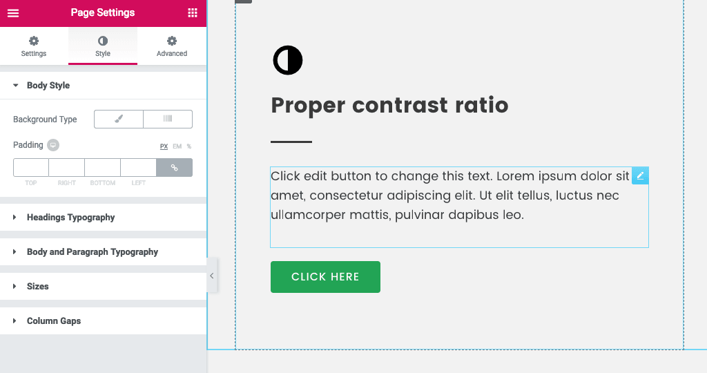
Headings Typography
This section will allow you to set up the typographic styles for all your heading Elements in the layout. You can have a cascade of styles ranging from H1 to H6.
Body and paragraph
A section that will allow you to define the properties of the body and paragraph texts. The styles wll also cascade here so if you do not want to make a separation on the properties of your body and paragraph text, feel free only to tweak the Body font properties.
Sizes
Sizes in the Elementor editor is a beautiful abstraction that allows you to separate styling from HTML heading tags. In other words, you can assign the “XXL” size to any of your heading Elements in your layout, and they will get an “XXL” treatment in size, while maintaining their HTML tag as for example H4.
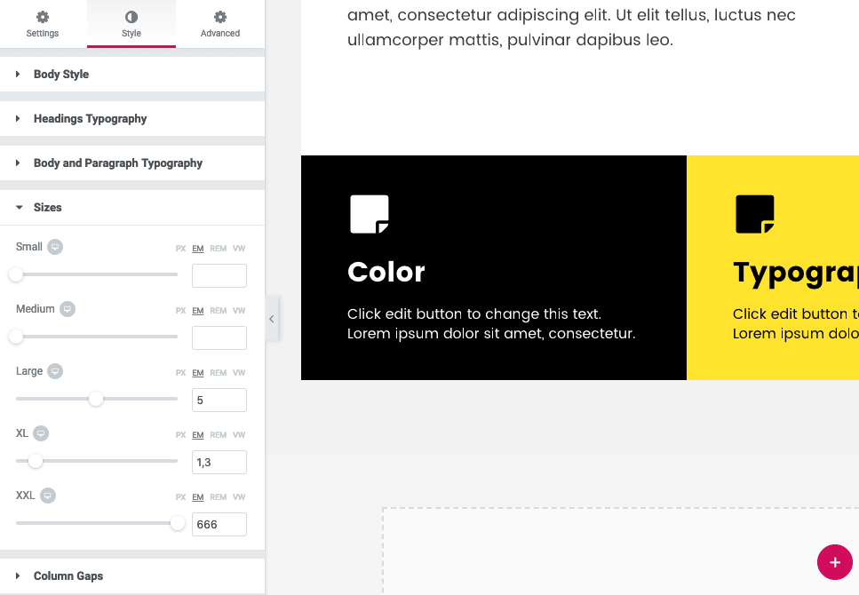
The Sizes panel allows you do just that. Define a visual Typographic hierarchy based on the abstraction of size. While it is always a good idea to keep a consistent proportion between your size abstractions in this panel and the sizes of your Headings, you can go beyond your typographic scale and fine-tune the values to match your needs.
Column Gaps
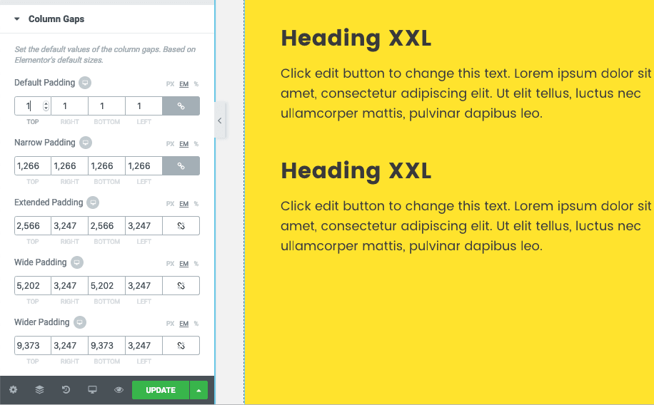
We love column gaps for consistency across sections of our layout. We now have provided a way to define those gap values in a responsive way as well.
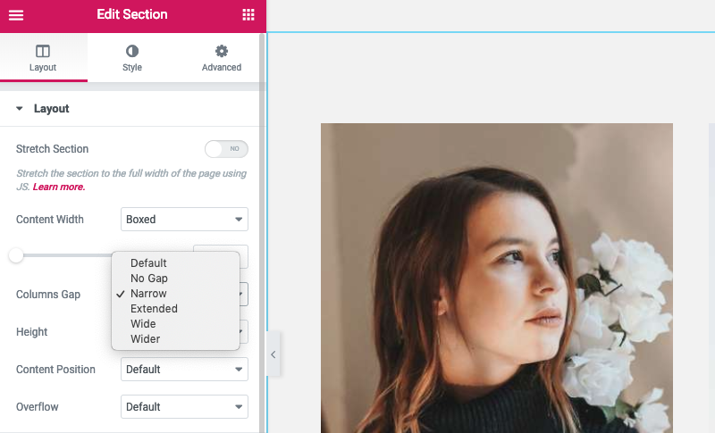
Column gaps is a great way to be consistent in your spacing, especially for inner section columns where a common spacing pattern is usually seen. Again you can set those values for tablet and mobile as well, and apply them on the fly on any of your layout’s sections.
How to activate the beta feature
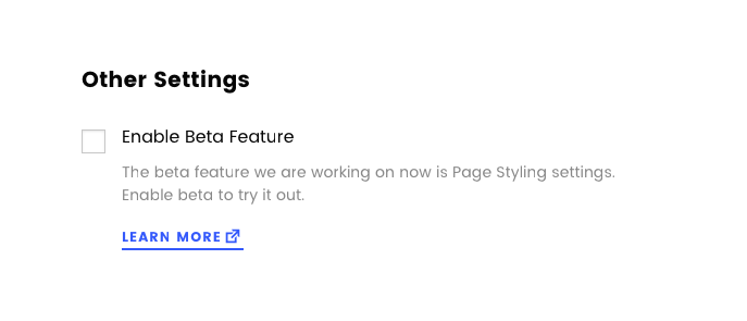
In order to activate the page styling settings as a beta, you need to simply check a box. At your dashboard go to AnalogWP panel and choose the Settings Tab.

At the settings page, scroll down and just check the related checkbox to enable the beta feature. Today it’s Page styling settings, tomorrow it might be something else. This place is where you should be able to enable or disable it, whatever beta feature we are testing.
Things to note
Currently, the styles apply only to the page/layout you are working on. If you save your layout as a template, the settings should be saved with it. When you import the layout from your library into your page, the styles should come with the layout as well. If they don’t, please drop us a line. It’s called beta for a reason!
Please note that although the beta actually works, things will probably change, so do not build any serious work on this release.
Your feedback is much appreciated and will help us drive the feature towards a high level of usability for our Elementor-powered workflows.